Preamble
OK, these are my results of a pretty non-scientific analysis of the game "Monopoly". I don't think much of the game itself; I am firmly of the impression that it becomes clear quite early on who's going to win and the rest of the game is just a protracted war of attrition. It does, however, have a nice simple concept to it and it's certainly popular.
I worked these out using an Excel 97 spreadsheet I knocked up. It acts as though one player was just going around and around the board; recalculating the spreadsheet will simulate a move in each row going down the sheet. There aren't any macros in it, except some code I knocked up to run it multiple times. It's a bit rough-and-ready.
Although I am British, I'm afraid I've used the American Monopoly board to run this - it wouldn't take more than an hour or so to run the results on a British board but the only thing stopping me is that I couldn't find a list of Chance and Community Chest cards anywhere, and I don't own a copy of the game. If anyone has the lists of these then please mail them to me and I'll run the sim on them and publish the results here.
The Results
Name |
Colour |
Prop times |
In Jail/Just Visiting |
6.11% |
|
B. & O. Railroad |
Rail |
3.31% |
Illinois Avenue |
Red |
3.18% |
Reading Railroad |
Rail |
3.10% |
Go |
3.07% |
|
New York Avenue |
Brown |
3.04% |
St. Charles Place |
Pink |
2.92% |
Tennessee Avenue |
Brown |
2.90% |
Short Line |
Rail |
2.85% |
Free Parking |
2.83% |
|
Kentucky Avenue |
Red |
2.79% |
St. James Place |
Brown |
2.79% |
Indiana Avenue |
Red |
2.74% |
Pacific Avenue |
Green |
2.64% |
Pennsylvania Railroad |
Rail |
2.64% |
Atlantic Avenue |
Yellow |
2.63% |
Marvin Gardens |
Yellow |
2.60% |
Ventnor Avenue |
Yellow |
2.60% |
Boardwalk |
Dark Blue |
2.60% |
Water Works |
Utility |
2.60% |
North Carolina Avenue |
Green |
2.60% |
Community Chest |
2.59% |
|
Pennsylvania Avenue |
Green |
2.53% |
Virginia Avenue |
Pink |
2.48% |
Income Tax |
2.48% |
|
Connecticut Avenue |
Mid Blue |
2.41% |
States Avenue |
Pink |
2.37% |
Vermont Avenue |
Mid Blue |
2.34% |
Electric Company |
Utility |
2.33% |
Community Chest |
2.29% |
|
Luxury Tax |
2.24% |
|
Oriental Avenue |
Mid Blue |
2.23% |
Mediterranean Avenue |
Purple |
2.21% |
Baltic Avenue |
Purple |
2.13% |
Park Place |
Dark Blue |
2.09% |
Community Chest |
1.93% |
|
Chance |
1.00% |
|
Chance |
0.93% |
|
Chance |
0.87% |
|
Go To Jail |
0.00% |
Clearly Jail gets landed on a great deal - not only because it is on the board twice (both Go To Jail and Just Visiting) but also because three doubles in a row send you there and it's the ultimate destination of both a Community Chest and a Chance card. The end result of this is that the red/brown properties following Jail get a nice rental income from recently-released convicts. You might also expect the pink properties immediately after Jail to pick up a bit of this traffic but unfortunately they're disadvantaged by the fact that the minimum roll with two dice is of course two (knocking out St Charles Place) and many people leaving Jail are rolling doubles (eliminating States Avenue). St Charles Place gets something of a reprieve as one of the Chance cards directs people there.
If we look at the percentage likehood of any given square being landed on, we end up with a graph looking something like this.
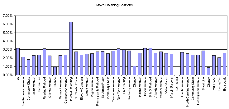
We can see that the properties after Jail end up with a slightly better ratio than those before it, tailing off again after Go To Jail. Note that these are the positions one ends up in once a move is complete, so the Chance squares end up with low figures (because they quite often direct you elsewhere) and Go to Jail has zero because, well, you always end up in Jail.
Another thing worth noting is the success of the railroads. In the American game (which I used here), there are three Chance cards which land you up in a railway station (one direct to Reading Railroad, and two to the nearest one).
The Finances
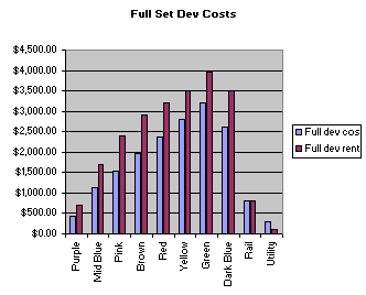 | You can never have too many graphs. As well as simulating moves around the board, we can also have huge fun working out the rental income of a set of properties compared to the cost of developing them. Well, ok, it isn't that much fun, but it was a bit easier to work out. The graph on the left shows the cost of developing a given set (i.e. buying all the properties and putting hotels on them) compared to the total maximum rental value of the set. I used average dice rolls to calculate the utilities' income values. Nothing hugely interesting here apart from the fact that the odd equality in cost of houses on each side of the board seems to be offset accurately by higher initial property costs. |
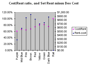 | Perhaps this will be a bit more interesting. The pink dots on this graph show the ratio of cost to rent from the graph above. Note that it is calculated as cost divided by rent, so the lower the points on the graph, the better. Interestingly we see that the cheaper properties tend to have the advantage - I think this was done (perhps not even deliberately, who can tell) to offset an important advantage that higher-rent properties have. The high-rent properties bring with them a greater chance of bankrupting an unfortunate tenant, and thereby gaining all the properties s/he owns. Towards the end of the game this is an essential element - you are much better off with a few high-rent properties than several low-rent ones. Additionally, high-rent properties suffer less from the gruesome "make repairs on all your property" chance card. Also on this graph, the blue dots show rent minus development cost. Interesting, the browns score very well here as well as on the hit rate table. |
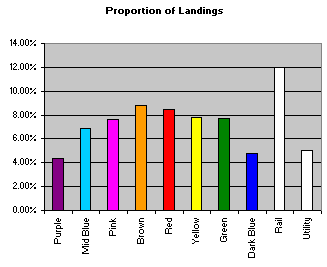 | OK, back to what gets landed on the most. Here's the results by set. Note that I haven't weighted them according to the number of properties in the set at all, so the purple, dark blue and utility sets don't do as well as the others on account of having only two properties. Likewise the stations look pretty good but bear in mind you have four to collect. Not too much to be said here that I haven't covered before. |
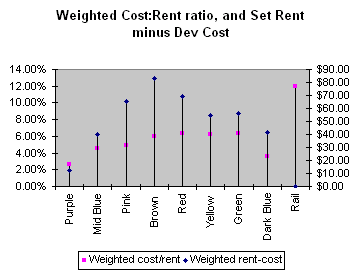 | Right, this one is probably the most interesting one. Are you sitting comfortably? This one basically shows the second graph (rent income vs dev costs) but weighted according to how often people land on them. The dark blues suffer as a result, but it exposes the purple ones as pretty crap. The railways look like a good investment although one has to remember the income isn't exactly huge. Overall, the properties in the middle of the board look like pretty sound propositions. |
Conclusion
In a lot of ways, all of this research is pretty worthless as you really ought to play according to what fate givs you rather than aim to complete a particular set from the start. However, if you end up with the choice of either one set or another then it might at least be partly useful. Which set is the best? Well, to me the browns and reds look pretty good, and the stations are definitely worth thinking about if you think you can bag them all. At the end of the day the real skill in playing (I'd think; I don't play the game) is in the wheeling and dealing one takes part in with other players, which is pretty much unquantifiable at least in terms of the research I've done. So all this is pretty useless. Any thoughts (or improvements to my spreadsheet), I'd be interested to hear them - use my feedback form.
Chris Rae, 26 Mar 03